
Contents
- What is AI logo design, and how does AI create logos?
- When should you use AI, and when should you not hand over the entire logo process to AI?
- How to design a logo with AI for free while still controlling quality
- How to evaluate whether an AI logo is usable for a brand
- Common mistakes when designing a logo with AI and how to fix them before use
- How can you use an AI logo as part of a brand identity, not just as an image file?
- Frequently asked questions about AI logo design
Businesses often use AI logo design to shorten the time needed for ideation, but it should not be seen as a complete replacement for brand thinking. This tool is useful when you need to test many options quickly, then filter for the least repetitive one, check the output file, and see whether the logo maintains its identity on light backgrounds, dark backgrounds, or at small sizes. Used correctly, it helps you know when to let AI assist and when to adjust manually to avoid lookalike logos, copyright issues, and files that are difficult to use for print or digital.
What is AI logo design, and how does AI create logos?
AI logo design is the use of data, layout patterns, and visual rules to generate logo options quickly from the information you provide. AI usually does not “draw from scratch” like a designer; instead, it combines shapes, text, colors, and styles based on patterns it has learned, so it is fast but can blur brand identity if the brief is too generic.
An online AI logo maker typically takes your brand name, industry, desired style, and a few emotional keywords. From there, the system generates multiple variations: wordmarks, symbol-plus-text logos, minimalist icons, or badge-style marks. The same prompt can produce different results because the model includes randomness, plus different interpretations of language, style, and the priority of each element.
What does AI need to create a logo?
AI needs clear input to create a brand logo with AI that better matches your needs. If you only enter “beautiful, modern logo,” the results often look alike and are hard to distinguish from competitors.
When guiding an AI logo prompt, include at least five details: brand name, industry, style, primary color, and the symbol or feeling you want to convey. For example, a coffee shop that wants a warm, handcrafted feel will need a very different prompt from a tech app that wants a clean, fast, trustworthy feel. The more specific you are, the easier it is for AI to stay on the right track.

Input checklist:
- Exact brand name.
- Industry or product category.
- Desired style: minimalist, premium, youthful, bold.
- Colors to use or avoid.
- Priority symbolic imagery.
When is AI output good enough for testing?
AI logo design is good enough for testing when you need a quick concept, have not finalized positioning, or want to compare several directions before investing in deeper design work. It is also a reasonable choice for startups testing a name, small teams needing an early draft, or an AI logo maker website for small businesses in the market-testing stage.
You should consider testing when the logo needs to answer three questions: does it clearly suggest the topic, is the name readable, and is it distinct enough to choose one or two strong options? If the AI logo is only for brainstorming, you can accept a moderate level of polish. If you need a consistent identity system across multiple platforms, the AI version should usually be only the starting point, then manually refined before final approval.
When should you use AI, and when should you not hand over the entire logo process to AI?
AI logo design is suitable when a business needs to quickly test multiple directions, gauge market response, or create a temporary logo for a landing page, new product, or short-term event. It is a practical way to produce a draft in a day, especially when the marketing team does not have an in-house logo designer.

Signs you should use AI to start the logo process
AI logo design should be used for initial concepts when the goal is speed and volume of options, not a final version from the start. A fast AI-generated logo is useful when you need 3–5 different concepts, then choose one direction to refine.
- You need to test multiple concepts before deciding.
- You need a trial logo for a campaign, landing page, or MVP.
- You do not yet have an in-house designer, but still need a temporary visual to move forward.
- You want to use an online AI logo maker to explore layout, icon, and color ideas.
For example, a software startup can use Canva Logo AI or an AI logo maker website for small businesses to generate multiple drafts. The marketing team then selects the most promising version for further manual refinement.
Signs you should avoid using AI as the final solution
AI logo design should not be the final solution when a brand needs a distinct identity, high control, and a scalable visual system. If the logo will live for a long time, appear across many channels, or involve legal and exclusivity concerns, the risks increase significantly.
- The brand needs strong exclusivity and clear differentiation.
- The industry has many competitors using similar styles.
- You need production-ready files for print and multiple formats and ratios.
- You need consistency across the full identity system, not just a single symbol.
The common risks are that the logo looks too similar to others, lacks brand depth, and is difficult to expand into a full identity system. In this case, AI should only be used to suggest ideas; the final decision should be controlled more carefully.
How to design a logo with AI for free while still controlling quality
AI logo design can still be controlled for quality even when it is free, if you prepare a concise brief, generate multiple variations, and then fix small details before using it for real. The most effective approach follows three steps: enter the right input, choose the right style, and finalize with technical checks.
Step 1: Prepare your input before generating the logo
AI logo design will produce better results when you have a short, clear, and complete brand brief. You only need seven lines: brand name, industry, target customer, brand personality, preferred colors, symbols to include, and words to avoid.
Checklist you can copy right away:
- Brand name:
- Industry:
- Target customer:
- Personality: minimalist, premium, friendly, tech…
- Preferred colors:
- Symbol to try:
- Words/phrases to avoid:
For example, a beverage brand for office workers should specify “clean, modern, easy to recognize as a small icon,” rather than simply writing “beautiful.” The more specific the logo prompt is, the less likely AI is to wander and generate unnecessary details such as too much gradient, cluttered icons, or hard-to-read fonts.
Read more: How to Measure Website Performance Correctly and Avoid Mistakes
Step 2: Choose a style and generate multiple versions to compare
The most effective way to use AI to create a logo for free is not to settle on the first version. Generate at least 3–5 variations in different directions, such as simple wordmarks, symbol-plus-text, or badge-style logos.

When comparing brand logo creation with AI, prioritize three criteria:
- Readable: the name is still recognizable at small sizes.
- Memorable: it has a distinct point of emphasis and does not look generic.
- Usable: it works for avatars, websites, slides, and basic print materials.
If a version looks good but only works at large sizes, discard it. With online AI logo makers, a common mistake is that the design looks fine on screen but becomes unbalanced when reduced to an avatar.
Step 3: Edit before downloading and using it for real
Automatic AI logo design is only the first step; the final version needs technical adjustments before you download the logo PNG SVG. Check letter spacing, contrast, icon edges, and light/dark background versions.
Follow this order:
- Loosen or tighten kerning if the letters are too close or too far apart.
- Change the color to a version with clear contrast on both white and dark backgrounds.
- Export at least one transparent-background PNG and one vector version if the tool supports it.
A common mistake is downloading the first version and using it immediately, which makes the logo look blurry on a website or pixelated in print. If possible, refine the AI logo in Adobe Illustrator or an equivalent vector editor to clean up the lines before use.
How to evaluate whether an AI logo is usable for a brand
Whether an AI logo is usable for a brand depends on readability, quick recognition, and visual stability across platforms. When evaluating AI logo design, check it both visually and in real use: shrink it, change the background, place it on an avatar, header, and a test print.
Check the logo at small sizes and on different backgrounds
A good logo remains readable at small sizes and does not disappear when placed on light, dark, or image backgrounds. For a PNG SVG logo, export at least two versions and place them in a favicon, social avatar, website header, and a basic print sample to see which details break first.
Quick checklist:
Read more: AI in Marketing Data Analysis
- Reduce it to around 32px and 64px and see whether the symbol is still recognizable.
- Place it on white, black, and a busy image background.
- Check whether the empty space around the logo is sufficient, especially for online logo design.
- If the letters stick together or the strokes are too thin, fix them immediately.
If the logo only looks good in a large demo image, it is not safe enough for real use.
Check distinctiveness and memorability
A good logo should create a clear brand identity rather than just look “fine.” If the symbol is too generic, the colors too safe, and the typeface too common, people will remember a vague impression instead of the brand.
A quick test is to place the logo next to 3–5 examples in the same industry and look at it for five seconds. If you still cannot describe what makes it different, the logo lacks a unique signal. Watch for familiar mistakes: a symbol that repeats an existing motif, a weak color combination, a font with no personality, or a layout that looks exactly like a template.

A professional logo needs one distinctive detail that helps users remember it after the first touchpoint. If needed, adjust the symbol, font, or proportions before making it part of the official identity system.
Common mistakes when designing a logo with AI and how to fix them before use
AI logo design can save time, but the draft should only be used after checking distinctiveness and usability. The safest way to fix it is to do three things: make the logo less like an existing template, standardize the variations you need, and test it at real sizes and on real backgrounds before publishing.
The logo looks too much like a template or another brand
AI logos often repeat because the tool tends to favor common layouts and symbols such as leaves, shields, circles, monograms, or minimalist icons. If the logo looks familiar, the text is too generic, or the overall design could easily be mistaken for an active brand, stop using that version.
Fix it in three steps:
- Rewrite the prompt to describe the industry and brand personality, instead of only saying “minimal logo” or “modern.” For example, for a coffee brand, specify “logo for a specialty roastery, warm feel, sturdy serif type, stylized coffee bean symbol.”
- Remove overly generic keywords such as “clean,” “professional,” and “minimal” if they push the output into a cliché direction.
- Create 3–5 variations in symbol, layout, and typography, then choose the one that looks least like a template.
A quick trick is to view the logo at 100 px and glance at it for three seconds. If it immediately reminds you of a familiar logo, it needs more work. With AI logo design, do not use the first preview version on a website or in a brand profile.
The logo lacks usability in a marketing system
Read more: How to Use Canva to Design Effective Ad Images
A logo that looks good only in the preview screen but performs poorly on a website, avatar, slide, or print file is a problem that needs immediate fixing. Common signs include thin text that becomes blurry at small sizes, too many icon details, or a background color that feels clearly off.
Handle it in four specific steps:
- Finalize one version for light backgrounds and one for dark backgrounds.
- Create horizontal, vertical, and monochrome versions for flexible use.
- Check the logo at real sizes: 24 px, 48 px, 120 px, and 200 px.
- Place the logo on a Facebook avatar, website header, PowerPoint slide, and PDF file to see whether it is still readable.
If you export files, keep a vector version such as SVG or AI and add a transparent-background PNG for digital channels. When editing in Adobe Illustrator, reduce small details, increase stroke weight, and add more space between the symbol and the text. If the logo only works at one size, that is a sign the proportions need to be redone, not forced into use.
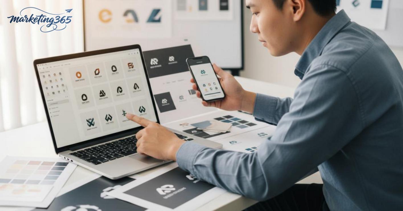
Checklist before using an AI logo
An AI logo should be checked against a short list before it becomes part of the official identity. This checklist helps avoid template-like designs and display issues across marketing channels.
- Is the logo clearly different from 3–5 logos in the same industry?
- Do you have horizontal, vertical, monochrome, and transparent-background versions?
- Is the text readable at 24 px and 48 px?
- Does the logo work on light, dark, and image backgrounds?
- Do you have an SVG or AI source file for future edits?
If any of the items above are missing, do not use the logo on your website, social profiles, or sales materials yet. For small businesses, one extra review round like this can prevent many fixes after printing or public posting.
How can you use an AI logo as part of a brand identity, not just as an image file?
An AI logo only delivers value when it is placed inside an identity system with rules for reuse. If you only save one PNG file, the marketing team will easily drift on color, font, and spacing when posting, presenting, or printing.
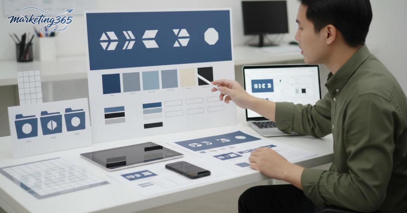
The minimum elements to standardize after finalizing the logo
To make AI logo design last, finalize a minimum identity kit that includes colors, typography, logo versions, and spacing rules. When this is done early, the team only needs to open the file to know how to use it, instead of guessing by feel.
- Primary and secondary colors, with clear HEX or RGB codes.
- Fonts for headings and body text, ideally 1–2 web-friendly options.
- Horizontal, vertical, monochrome, and inverted logo versions for light/dark backgrounds.
- Safe space around the logo to prevent it from being crowded by images, icons, or call-to-action buttons.
- Basic files: transparent PNG, SVG, or AI for future edits.
A small team usually only needs a one-page brand guideline. It should clearly state how the logo is used on avatars, banners, sales decks, and website footers. If you also define a minimum size rule, you will avoid the logo breaking down when reduced on mobile.
When should you move from an AI logo to deeper design refinement?
AI logo design should be upgraded when the logo starts appearing at many touchpoints and no longer stays consistent. The clearest sign is when the same logo is edited differently by different people, or when it no longer holds up in print, embossing, signage, or very small sizes.
You should move to deeper refinement when:
- The brand is growing and needs a consistent multi-channel identity system.
- The logo needs registration, copyright standardization, or clear primary/secondary versions.
- The marketing team must use the logo across landing pages, social, proposals, and print materials at the same time.
- The current AI logo is difficult to deploy for long-term brand design.
At that point, the right step is not to start over, but to refine the logo structure, letter spacing, and symbol proportions in Illustrator. If you have already created a brand logo with AI but it is not stable yet, treat it as a draft for building the identity system, not the final file.
Frequently asked questions about AI logo design
An AI logo can be used for a business if you can control its recognizability and editability after generation. For long-term logos, AI should be treated as a fast draft, then refined before being used on a website, social profile, or in print.

- Can AI logos be used for businesses? Yes, if the logo is simple, visually clear, and does not feel too similar to competitors in the industry. A common case is a small shop needing a temporary logo for a quick launch; once the brand stabilizes, you should still review the layout and font.
- Should you use a free AI logo? It is fine for testing ideas, but not as the default choice for the main identity system. Free versions often lack detail control, can resemble common templates, and may not be flexible enough when you need multiple formats.
- Should you export PNG or SVG? You need both, but for different purposes: PNG is suitable for web and social media, while SVG is better for print, scaling, and preserving sharpness. If you can only choose one, prioritize SVG for the main logo.
- Do you need to edit it after generation? Yes, almost always. At minimum, check letter spacing, symbol balance, and background color when placed on real images. If you use AI logo design software, you should refine it so the logo feels less like a mass-market template.
A safe workflow is: create 3–5 options, choose the clearest one, export PNG/SVG, test it on an avatar and banner, then see whether the logo is still readable at small sizes. If it becomes cluttered at 32px, it needs fixing before official use. For marketing teams, that is a way to reduce risk when creating a brand logo with AI while still keeping deployment fast.
For the latest official guidance, you can also refer to resources from Think with Google.
You can also find more practical marketing guides at https://marketing365.vn.
Content from marketing365 is created for SMEs, online shop owners, and new marketers.
You can read more articles on the same topic in the AI Marketing category.