Contents
- What is Canva, and when should you use it to make ad images?
- Choose the right size and format before designing
- How to adjust templates in Canva to create ad images that match your goal
- How can you make ad images with a clear layout that is understood at a glance?
- Optimize images for Facebook, Instagram, and other channels
- Export files, check quality, and avoid mistakes before posting
- Canva Free vs Canva Pro: how far is enough?
- When should you do it yourself in Canva, and when should you get professional support?
- Frequently asked questions about how to use Canva to design ad images
When you need to create ad images quickly, how to use Canva to design ad images is often most challenging around sizing, choosing templates, aligning layouts, and exporting files. If one step is handled incorrectly, the image can easily have cut-off text, look blurry, or lose brand consistency on Facebook, Instagram, or web banners. This section focuses on a workflow you can apply right away for shop owners, marketers, and fanpage admins: choose the right frame, adjust the template to match the goal, add the necessary content, and save the file in the right quality. You will also learn which signs show you only need to do it yourself, and when it is better to hand it over to someone with deeper experience.
What is Canva, and when should you use it to make ad images?
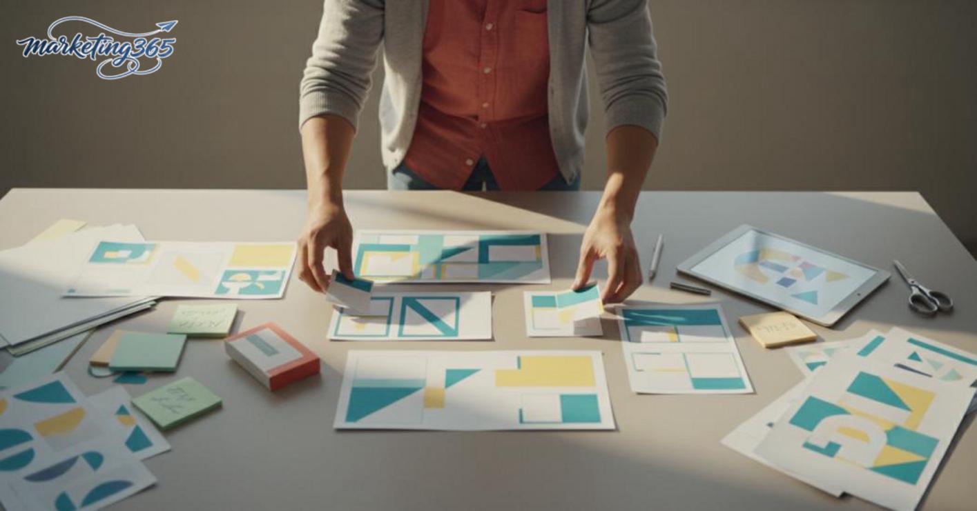
Canva is a fast design tool suited for creating simple, consistent, and easy-to-edit ad images when non-designers need to produce visuals in a short time. With how to use Canva to design ad images, you can usually handle tasks like promotional banners, Facebook post images, Instagram visuals, product images, or basic posters for fanpages and social media ads.
What marketing and sales needs does Canva solve?
Canva is a good fit when the goal is to make ad images that look good enough, are the right size, and can be edited quickly for each campaign. Sellers often use Canva to create ad images for sale banners, post visuals, Instagram ad posts with Canva, or Canva Facebook ads banners without having to build complex files.
Its strengths are speed, templates, and drag-and-drop editing. A marketing team member can change the headline, price, colors, and logo in a few minutes, then export multiple versions of the same content. For recurring needs such as how to make a banner ad on Canva or a guide to designing product ad images with Canva, this is a practical and time-saving approach.
When is Canva not the best enough choice?
Canva starts to show its limits when you need a consistent brand system, tight layout control, or to manage many ad versions across multiple channels at once. In that case, template limitations can make visuals look too similar, harder to refine deeply, and harder to keep distinct across ad groups.
Signs that you should consider changing your workflow include: needing many variations every week, needing to separate structures for digital channel management, or requiring very precise alignment, spacing, and typography. For professional ad design, Canva can still be a starting point, but it should not be the only tool if your team needs brand control and long-term optimization.
Choose the right size and format before designing
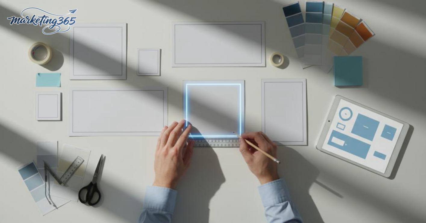
Choosing the right size and format from the start helps prevent ad images from having cut-off text, misaligned layouts, or needing revisions after the design is finished. With how to use Canva to design ad images, this step should be done before adding text, logos, or product photos so the correct proportions and safe areas are preserved for each channel.
How to choose image sizes for each common channel
Start by identifying the posting channel, then choose the corresponding image size. Facebook feed usually needs a horizontal or square layout; stories need a vertical frame; banners and posters tend to favor a wider ratio to keep text readable. If you are working on how to choose ad image sizes in Canva, open the correct preset for the display placement instead of dragging any random frame and cropping later. When designing Instagram ad posts with Canva, square or short vertical images usually preserve breathing room better than overly wide ones.
Quick checklist:
- Choose the posting destination first: feed, story, banner, or thumbnail.
- Identify the actual display placement: post, ad frame, or landing page.
- Open the right size first, then add the main content.
- Leave a safe area at the top, bottom, and both sides.
- If you need reuse, create separate versions instead of forcing one file for every channel.
Common mistakes when choosing sizes and how to avoid them
The most common mistake is finishing the design and only then realizing the text is too small or the logo is too close to the edge. At that point, the image can easily be cropped in the feed, story, or thumbnail and lose readability immediately. For a well-designed file, the safe area must be large enough so important information does not touch the edges, especially when making how to create a banner ad on Canva or images used across multiple platforms.
The fix is simple:
- Prioritize the correct output format, not the fastest frame.
- Do not cram too much text into one image.
- Keep the logo, CTA, and main value in the center area.
- If you must reuse one file, export separate versions for each channel instead of forcing one crop.
How to adjust templates in Canva to create ad images that match your goal
Choosing the right template in Canva is the step that determines whether the ad image goes straight to the goal, because the layout, reading rhythm, and spacing are already defined from the start. When adjusting a template, the creator needs to keep the advertising logic intact: the viewer sees the product, understands the benefit, and then takes action.

Choose templates by ad goal, not just by how nice they look
The right template is one that matches the campaign goal, the posting platform, and the amount of information that needs to fit into one frame. For example, a flash sale needs space for the price, discount percentage, and a short CTA; a product introduction image should prioritize a large visual, minimal text, and one main message. With canva template marketing, you should filter by industry and format first, then choose a ready-made template. A beautiful template designed for long-form storytelling can make an ad image feel diluted.
How to use Canva to design ad images effectively means treating the template as a framework, not a finished product. If you are posting to Facebook feed, choose a square or horizontal layout with enough space to read on mobile; if you are designing Instagram ad posts with Canva, prioritize short text blocks and a main visual in the center area. For a new collection, minimalist templates often feel more premium than ones with too many effects.
Quick selection checklist:
- Is there room for the main headline?
- Is there a clear area for the product image?
- Does the CTA stand out without overpowering the content?
- Does the template color fit the industry?
Edit the content, colors, and layout without making the image cluttered
Editing a template correctly means preserving the visual hierarchy and replacing content in the order the viewer needs to read it. For product ad images, prioritize the headline, main benefit, product image, and a short CTA; secondary details such as promo labels, icons, or notes should only be added if there is still breathing room.
When editing an ad template in Canva, do not add too many fonts or split the content into overlapping blocks. A clear ad image usually only needs 1–2 fonts, 2–3 main colors, and one strong focal point. If the background is too bright, reduce saturation or place a blurred background layer behind the text to improve readability. If the product has a bold color, keep the text neutral so it does not compete with the image.
Recommended process:
- Remove unnecessary sample text.
- Keep the headline block and main visual.
- Move the CTA to the final reading position, usually the bottom corner or beside the product.
- Zoom in on a phone screen before exporting to check readability.
If the text feels too faint, fix the contrast before thinking about effects. That is how to use Canva to design ad images to achieve the right goal without cluttering the layout.
How can you make ad images with a clear layout that is understood at a glance?
An ad image has a clear layout when viewers immediately know what the main message is, what the supporting details are, and what action they need to take. With how to use Canva to design ad images, the goal is for someone scrolling to grasp the content in 1–2 seconds.
Quick checklist before exporting:
- Reduce the image to mobile viewing size.
- Identify the first focal point: headline, product, or price.
- Keep content to a maximum of 3 layers: main, secondary, CTA.
- Leave space around the important text block.
- Make the text hierarchy clear: headline largest, notes smallest.
How to arrange information so the image does not feel overloaded
Readable ad image layouts start with filtering the content before dragging anything into the design. When there are too many words, viewers have to read instead of scan, and the image loses its effect immediately.
Keep a 3-layer structure: 1 main message, 1 supporting benefit, 1 desired action. For example, instead of stuffing in product descriptions, offers, policies, and multiple supporting lines at once, keep only the most important information. Designing online ad images with Canva becomes cleaner when each frame answers just one question: what does the viewer need to know first?
If the content is still dense, remove secondary details before adjusting colors or fonts. That is the fastest way to reduce clutter.
Where should you place the logo, price, and CTA for easy reading?
The logo, price, and CTA should be placed by priority, not squeezed into the main headline area. The logo only needs to be recognizable, usually placed in a top or bottom corner as long as it does not cover the message.
The price or offer should sit near the first focal point, while the CTA needs to be separated from smaller text so it is easy to scan. When adding a logo and contact information to an ad image in Canva, do not force everything too close to the edges or pack it into one dense text block. For banner ads, a clean layout usually reads faster than one with too many effects. If you include a phone number or extra note, make it smaller than the headline and keep it safely away from the image border.
Optimize images for Facebook, Instagram, and other channels
Multi-channel ad images only work when the message stays the same but is adjusted for viewing behavior, aspect ratio, and text density on each platform. When using how to use Canva to design ad images to create a set of visuals for multiple channels, you should quickly separate which ones need to stop the scroll, which ones need strong visuals, and which ones are likely to lose content when cropped.

Differences between images for Facebook feed, story, and banner
Facebook feed usually needs an image that grabs attention within the first second, so the text should be minimal and the layout clear. Stories are vertical and users scroll quickly, so the main message should sit within the safe area; banners, meanwhile, should prioritize brand recognition or one short benefit and avoid too many details. With canva banner facebook ads or designing Instagram ad posts with Canva, focus on three things: choose the right size, check the cropped areas, and reduce the number of text lines before exporting. If a feed image can still hold one short sentence, a story should be reduced to something readable at a glance in a few seconds, while a banner should keep one main focal point so the message does not feel diluted.
| Channel | How it is viewed | What to prioritize | Common mistake |
|---|---|---|---|
| Facebook feed | Stops the scroll | Strong visual, little text | Small text, cluttered layout |
| Story | Vertical, fast scrolling | Vertical image, message in the center | Logo/CTA gets cut off |
| Banner | Glance view | Brand recognition, short benefit | Too much text |
When should you use one design for multiple channels, and when should you not?
A single design can work across multiple channels when the message is short, one main visual is clear enough, and there is only one CTA. In that case, you only need to adjust the frame ratio or safe margins. On the other hand, if the image has a lot of text, multiple calls to action, or needs detailed product information, you should create separate versions to avoid reducing readability. How to use Canva to design ad images effectively means making one master file and then creating variations for each channel instead of dragging and dropping the exact same version everywhere. For website and communications management, this approach keeps multi-channel ad images consistent while still matching the display context; especially when you need to export many versions quickly without breaking the layout.
Export files, check quality, and avoid mistakes before posting
Exporting in the right format helps images stay sharp, display well on mobile, and avoid broken text after posting. When working with how to use Canva to design ad images, you should export based on the posting destination and content type: social media images should prioritize PNG, images with lots of text should be checked for sharpness before use, and lightweight files should use high-quality JPG.

What file type should you export for social media and ads?
PNG is the safest choice for most ad images because it preserves text and edges better. JPG is suitable when the image is mostly a photo, has little text, and needs to load quickly. If you are using canva pro, you should also check the preview after exporting to catch stretching issues, lost safe margins, or shifted background colors.
Practical checklist for choosing a format:
- Images with logos, slogans, prices, and CTAs: prioritize PNG.
- Product photos with many gradients: high-quality JPG is acceptable.
- Online ad images made with Canva that contain a lot of text: always open the exported file and inspect each line.
- If transparency is the goal, use only a format that supports that need properly.
Quick pre-publish checklist
A perfect design file must be readable on a small screen and keep its layout intact when viewed again.
- Open the file on a phone or shrink the window to about 25–33% to check readability.
- Inspect each line of text: is it blurry, cut off, too tightly spaced, or misaligned?
- Check the logo, price, CTA, and link if there is one; even one wrong character needs to be fixed immediately.
- Recheck the safe space around the image edges to avoid cropping when posting on different platforms.
- Compare background and text colors in both light and dark modes; colors that are too close together will make the image hard to read even if it looks fine on a computer.
A final check is usually much faster than reposting and fixing each channel one by one. If the image has a lot of text or is used for advertising, save a backup version so you can change the CTA or size later without damaging the original layout.
Canva Free vs Canva Pro: how far is enough?
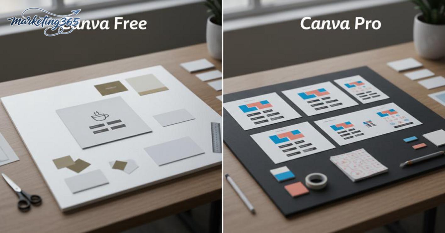
The comparison between Canva Free and Canva Pro should be based on workload frequency, how much brand consistency you need, and how often you have to revise the same template. For simple needs, the free version is enough to create post images, single posters, and test the process of creating ad images with Canva before deciding to upgrade.
Who is Canva Free suitable for?
The free version is suitable for low-frequency content creators, small shop owners, and beginners who need how to use Canva to design ad images for individual posts. Just choose a template, edit the headline, replace the image, and export the file, and it is enough for formats like online ad images made with Canva or a product introduction banner.
- Use it when you only need a few images per week.
- Use it when you do not yet need a fixed brand identity system.
- Use it when you want to try how to make a banner ad on Canva first.
- Use it when you are comfortable adjusting each template manually.
If you only make promotional posters, Facebook post images, or beginner-friendly ad poster designs with Canva, the free version is often enough.
When should you consider upgrading to Canva Pro?
You should consider canva pro when you create many versions for the same campaign, need Canva Pro guidance to keep fonts, colors, and logos consistent, or have to repeat the same actions across many designs. In that case, the ability to reuse marketing templates and manage assets saves time much more clearly than editing each file individually.
- You need to create multiple variations for A/B testing.
- You need how to insert a logo and contact information into an ad image in Canva once and reuse it.
- You need how to choose ad image sizes in Canva for multiple channels.
- You need how to export high-quality ad image files from Canva for a team.
If you only occasionally edit a template, Pro may not create a big enough difference to justify upgrading right away.
When should you do it yourself in Canva, and when should you get professional support?
If the need is just a single image, a clear message, and few variations, you can do it yourself in Canva to handle it quickly. When the work requires multi-channel consistency, multiple versions, and deeper revisions, it is better to move to professional support to protect brand identity and reduce rework.
Signs that you should do it yourself with Canva
You should do it yourself when you only need one promotional banner, one Facebook post, or one ad image with an existing logo, color palette, and font. With how to use Canva to design ad images, the process usually revolves around choosing a template, changing the text, inserting the image, and exporting in the correct size.
Checklist for when self-service is appropriate:
- Each campaign has only 1 main message.
- You only need 1–3 variations to test.
- The brand kit already includes the logo, colors, and fonts.
- You do not need to adjust the layout too deeply.
For example, a small fashion shop may only need to run 3 discount banner versions for Facebook Ads and the fanpage. If the image still reads well on a 6-inch screen and does not get cut off on mobile, doing it yourself in Canva is enough.
Signs that you should get professional support
You should get professional support when you need consistent digital channel management across the website, ads, and fanpage, or when one template has to be used for multiple customer groups. At that point, professional ad design helps reduce brand drift, size errors, and reuse problems.
Signs that you should switch:
- You need multiple versions for multiple channels, such as Facebook, Zalo, and web banners.
- You need to keep the layout consistent across multiple ad runs.
- There are many revision rounds between marketers and approvers.
- You need to optimize information hierarchy, contrast, and mobile readability.
A common example is a product launch banner set for both the website and Meta Ads. If each file looks different, the headline is misaligned, the CTA is inconsistent, and it takes 3–4 revision rounds, a professional workflow will save more time than doing it piecemeal yourself.
In short, do it yourself in Canva when the task is simple, has few versions, and you already have enough brand assets. Get professional support when you need consistency, quality control, and lower risk of mismatches across channels.
Frequently asked questions about how to use Canva to design ad images
The frequently asked questions below help quickly resolve the most common issues when creating ad images yourself. Each answer goes straight to the action you need to take, so you can check before posting and avoid repeated revisions.
Does using ready-made Canva templates cause duplication?
You can use templates, but you need to customize them deeply so the image does not look like a mass-produced template. Follow 3 steps: change the colors to match the brand identity, adjust the font or text weight, then rearrange the information hierarchy to create a distinct focal point. For example, with a 1,080 x 1,080 px promotional banner, simply changing the background color, replacing the product image, and shortening the headline to 5–7 words can already make the layout look clearly different.
If you only change the text while keeping the same layout, focal point, and color tone, the image can easily resemble other templates. When using how to use Canva to design ad images for a fanpage, I usually do a quick check at 25% zoom on the screen; if it still looks like the original template, I keep changing the icon, image, or text block position.
How can you prevent ad images from looking blurry or pixelated when posted?
Images are less likely to look blurry if you choose the correct design size, use a source file with enough resolution, and export in the right format. Start with a 1080 x 1080 px frame for square posts or 1080 x 1920 px for stories, then export PNG if the image contains a lot of text and JPG if you need a lighter file. For images with small text, zoom to 100% in Canva before downloading to check the sharpness of the letters.
Follow 3 steps: check that the original image has enough resolution, choose Download at high quality, and avoid compressing it multiple times after downloading. If a Facebook post still looks washed out, it is usually because the source file is only around 800 px or the image was inserted from a source that was too small. When needed, replace it with a larger source image from the internal library or take a new photo with your phone in full-resolution mode.
Is Canva Free enough to make ad images?
Canva Free is enough for basic needs such as post images, simple banners, or short ad templates. If you only create 3–5 designs per week, the free plan is usually enough to test layouts, change colors, and gauge customer response. For small shops, this is a reasonable starting point before upgrading.
Choose Canva Pro when you need Brand Kit, background removal, or the ability to save multiple templates for reuse in campaigns. For example, a fanpage admin running 10 promotional designs per month will save more time if the font set, logo, and brand colors are already stored in one place. If the goal is speed, consistency, and fewer repetitive steps, Pro is worth considering; but if you only handle individual content pieces, the free version still works well.
For official and up-to-date guidance, you can also refer to resources from Google Ads Help.
You can also find more hands-on marketing guides at https://marketing365.vn.
Content from marketing365 is built for SMEs, online shop owners, and new marketers.
You can also read more articles on the same topic in the Martech Tools category.