Contents
- What do you get from decorating a Shopee storefront: a professional look, more clicks, and less clutter
- Before changing the interface: define the storefront layout and priority order
- How to make banners, cover images, and top sections eye-catching yet easy to read
- How should products, featured categories, and bestsellers be arranged to attract customers?
- How to use images, video, and short descriptions to build trust
- Common mistakes that make a Shopee storefront lose customers
- When should you do it yourself, and when should you get professional design support?
- Frequently asked questions about how to decorate a Shopee storefront to attract customers
A cluttered Shopee storefront can make shoppers scroll past very quickly, even if the products are good. For shop owners or channel managers who want to tidy up their store themselves, how to decorate a Shopee storefront to attract customers should start with the easiest layers to check: the storefront background, banner, categories, product placement, and priority display areas. With just a few basic steps done right, the shop becomes easier to look at, more consistent, and less likely to feel untrustworthy. This article focuses on practical steps you can apply right away, along with common mistakes to avoid when decorating by instinct.
What do you get from decorating a Shopee storefront: a professional look, more clicks, and less clutter
Decorating a Shopee storefront helps shoppers understand what the shop sells within seconds, trust the shop more, and click into the right products faster. When the shop interface is clear, the banner is visually consistent, the categories are complete, and the products are arranged in order, the storefront feels less cluttered and has a better chance of getting clicks.
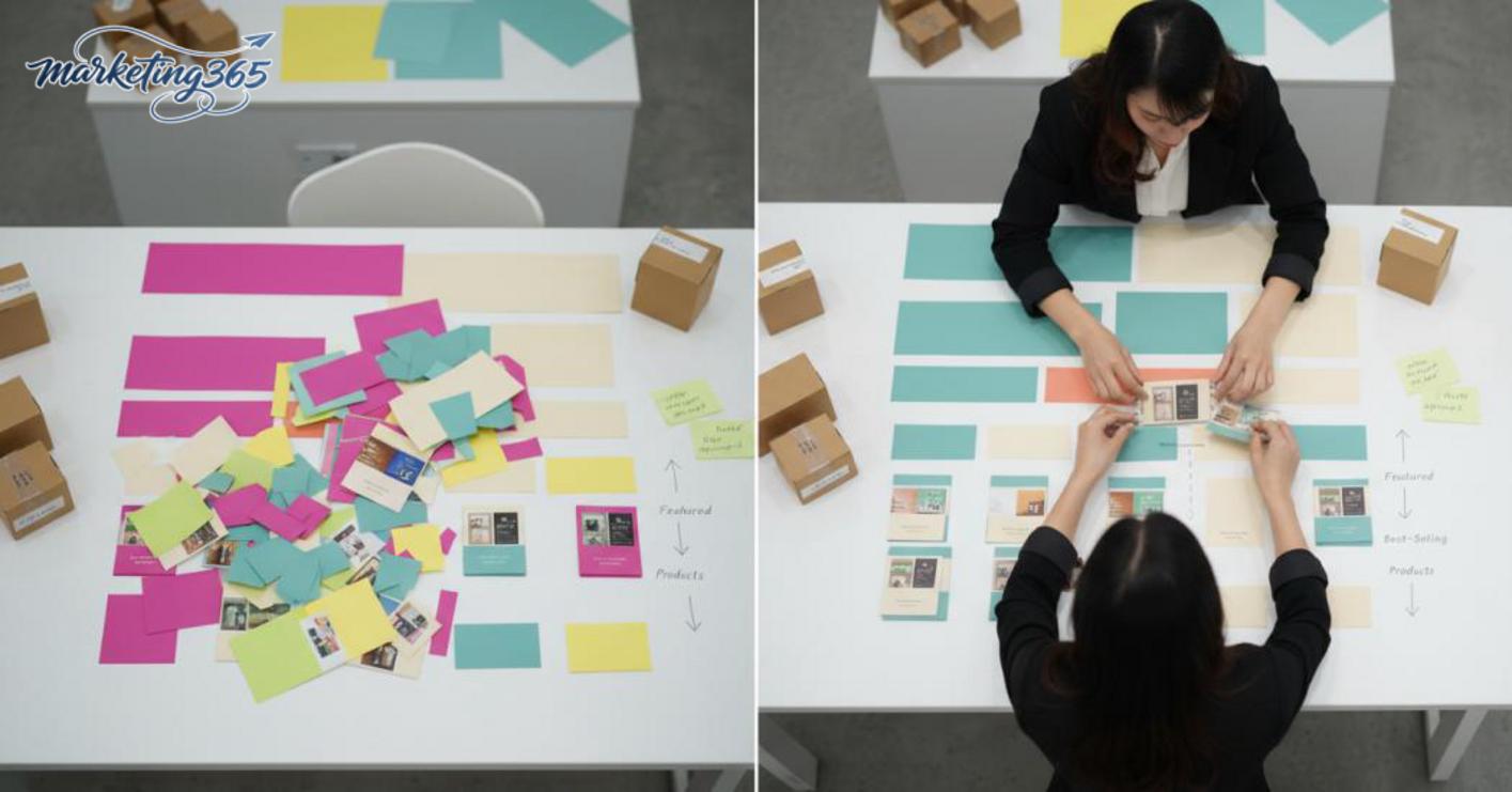
The signs of a weak shop are usually easy to spot: a banner with mismatched colors, cover images that look different from one section to another, products mixed together from bestsellers to new arrivals, and no categories for quick filtering. With an attractive Shopee interface design, the goal is not just to make it look nice, but to guide the viewer’s eye in the right direction.
When does a Shopee storefront need an immediate refresh?
The storefront needs an immediate refresh when the shop has just opened, when there are many products but low clicks, or when there is traffic but visitors do not go deeper. This is also the time to optimize the storefront if the banner and cover images are inconsistent, the categories are unclear, or standout products are getting lost in a messy shop interface.
Quick checklist:
- Do the banner colors match the cover images and product content?
- Do the categories help shoppers find the right product group in 1–2 clicks?
- Are best-selling products placed where they are easy to see?
- Is the promotions section prominent enough to draw visitors downward?
How does storefront decoration affect browsing behavior?
Shoppers usually look at the banner first, then search for categories, and only after that do they view featured products and bestsellers. If the layout is cluttered, they leave early; if the product arrangement on the Shopee storefront is clear, they tend to click deeper because they immediately know which section to explore.
A smoother browsing flow usually follows this order: banner → categories → featured products → bestsellers or promotions. That is why the way best-selling products are displayed on Shopee should place them in a highly visible area, while new items or supporting products should sit lower to avoid competing with the main products for attention.
Before changing the interface: define the storefront layout and priority order
Before changing the interface, finalize the storefront layout based on sales goals and product priority. How to decorate a Shopee storefront to attract customers only works when shoppers can immediately tell which product group the shop is pushing, which products are meant to drive clicks, and which products are there to build trust. If this foundation is not set, even a beautiful banner can still make the shop feel visually messy.
Identify which product group should be placed first
The first group should be best-selling products, easy-to-understand items, products with clear visuals, and products with a direct competitive advantage. With the way products are arranged on a Shopee storefront, prioritize a low-entry-price item or a product with a high selection rate to lead visitors onward, rather than spreading attention evenly across everything.
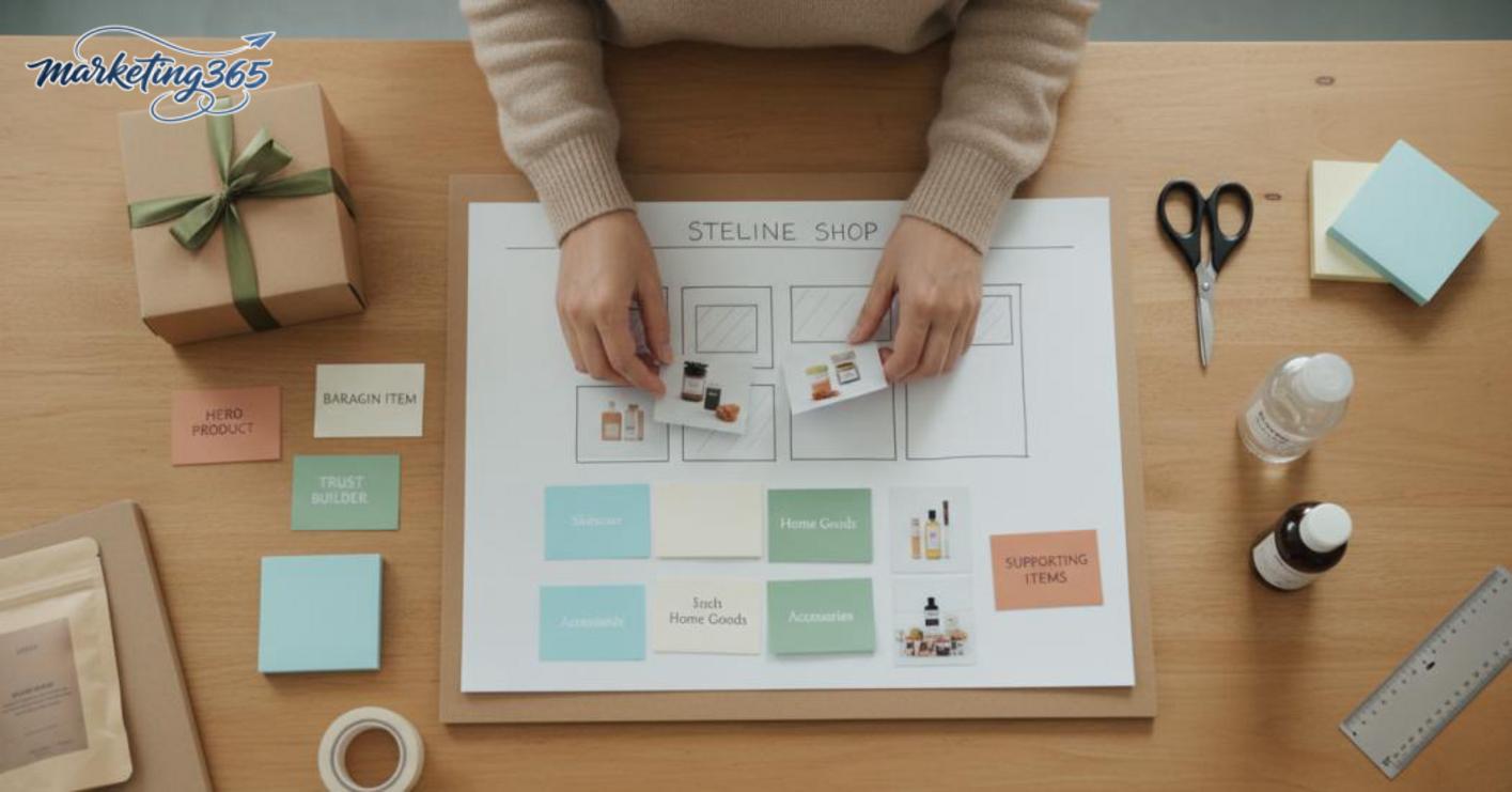
Quick selection method:
- Choose 1–3 best-selling products to display first.
- Place easy-to-understand products that need little explanation at the top.
- Include one low-entry-price item if the goal is to increase Shopee click-through rate.
- Keep the core product in the featured group, not pushed to the bottom.
If the shop has a new model but the photos are not good yet, do not put it at the top just to show it off. That item is usually better placed in a secondary position, while the top area of the storefront should be reserved for products that can keep shoppers engaged longer.
Arrange categories in a way shoppers can find easily
Categories should be short, clear, and based on buying needs, not internal technical names. The most effective way to create standout categories on Shopee is to divide them by product line or usage situation, so shoppers can tell where to go at a glance.
Arrangement checklist:
- Put the most important category first.
- Use short, easy-to-read names and avoid stuffing in too many keywords.
- Group products with the same need into one category.
- Separate promotions if the shop’s goal is to push orders quickly.
For example, a home goods shop should prioritize categories based on needs such as “kitchen,” “cleaning,” and “small accessories,” rather than using overly technical names. A professional Shopee storefront design makes it easy for shoppers to find what they need first, then browse deeper.
How to make banners, cover images, and top sections eye-catching yet easy to read
The top section determines whether shoppers stop or keep scrolling. With how to decorate a Shopee storefront to attract customers, the banner and cover images need to clearly communicate what the shop sells, what it does best, and which products are being pushed within the first few seconds.
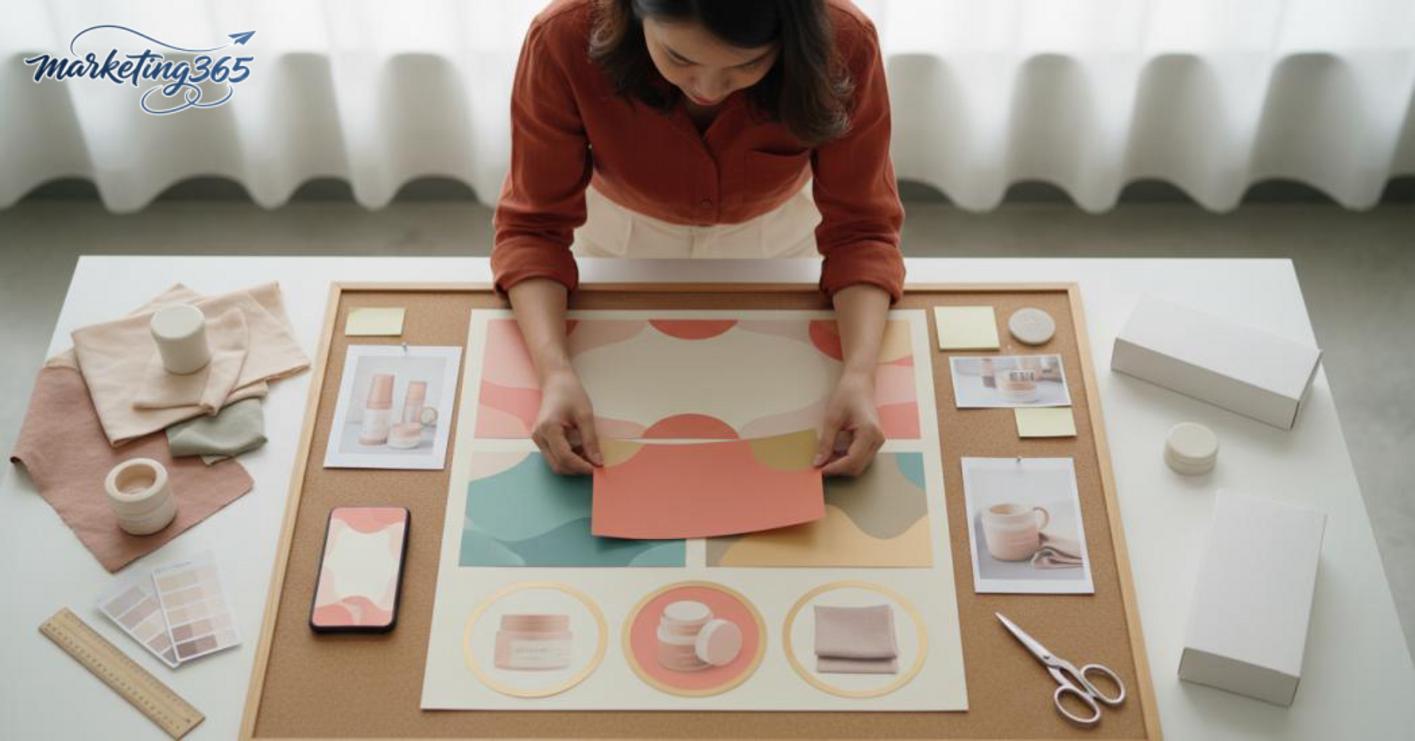
What information should a Shopee banner include?
An effective banner only needs a short message that can be read quickly on mobile. The best way to make a Shopee banner is to focus on four points: the shop name or product group, the main message, a standout strength, and any current promotion if applicable.
A clean Shopee banner template usually follows this order:
- Main product group: cosmetics, home goods, accessories, fashion.
- Clear advantage: free shipping, authentic, fast delivery, easy returns.
- Hero products: 1–3 items you want to drive orders for.
- Short message: “quick picks,” “today’s deal,” “bundle and save.”
For example, a kitchenware shop should not cram a hotline, a long slogan, and five commitments into one banner. The product group name, a standout benefit, and one line highlighting the best-selling set are enough. If the text has to be shrunk to be readable, the banner is already overloaded.
How consistent should the cover image and shop header be?
The cover image, shop header, and banner should share the same color tone, font style, and product feel to make the Shopee interface look more professional. The goal is for viewers to feel a sense of consistency, without visual confusion when moving from the banner to the categories or product images.
Read more: How to Run Shopee Ads for Beginners
When the way a Shopee storefront cover image is added becomes too fragmented, common mistakes include a dark banner, bright product photos, too many font styles, and each section using a different color. It may look acceptable on desktop, but on a phone screen it can easily hide text, break the layout, and reduce trust.
Follow this consistency checklist:
- Keep one main color palette and one accent color.
- Use one easy-to-read font style across the top sections.
- Choose product images with the same background-cut style or shooting context.
- Leave space around text so it does not touch the edges on mobile.
- Check it again on a small screen before saving.
If the goal is how to decorate a Shopee storefront to attract customers, the top section must be both attractive and easy to read. Shoppers should be able to glance for 1–2 seconds and immediately understand what the shop sells and why they should click through.
How should products, featured categories, and bestsellers be arranged to attract customers?
How to decorate a Shopee storefront to attract customers works best when the things shoppers need to see most are placed right at the top and in the correct priority order. When the storefront has a clear layout, even quick scrollers can understand what the shop sells, which items to buy first, and which products are being pushed hardest.
The order should be: featured categories → core products → bestsellers → promotions → supporting products. With the way products are arranged on a Shopee storefront, each section should have its own role so shoppers do not get confused. A storefront with many sections but no order often makes customers stop halfway through, especially when they are viewing on mobile and only scroll through the first few screens.
Visibility checklist:
- Place featured categories at the top so customers can filter needs quickly.
- Put 3–6 core products in the first visible area.
- Group bestsellers into a separate section instead of mixing in too many supporting items.
- Place promotions near the products you want to push so customers see a reason to buy now.
- Keep supporting products at the bottom or in a “see more” area.
This approach fits a professional Shopee storefront design because it helps customers move from browsing to buying without having to guess what the shop prioritizes.
Where should best-selling products be placed to build trust?
Best-selling products should be placed in the top group or in a very visible area to create social proof as soon as customers enter the shop. When a product is displayed as a bestseller on Shopee in a prominent position, shoppers are often less hesitant because they can see that many others have already chosen it.
The best approach is to keep the bestseller section compact and only choose items that are truly strong in orders or fit common needs. Do not turn this area into a messy list, because too many products labeled as bestsellers will reduce credibility and prevent the Shopee click-through rate from rising as expected.
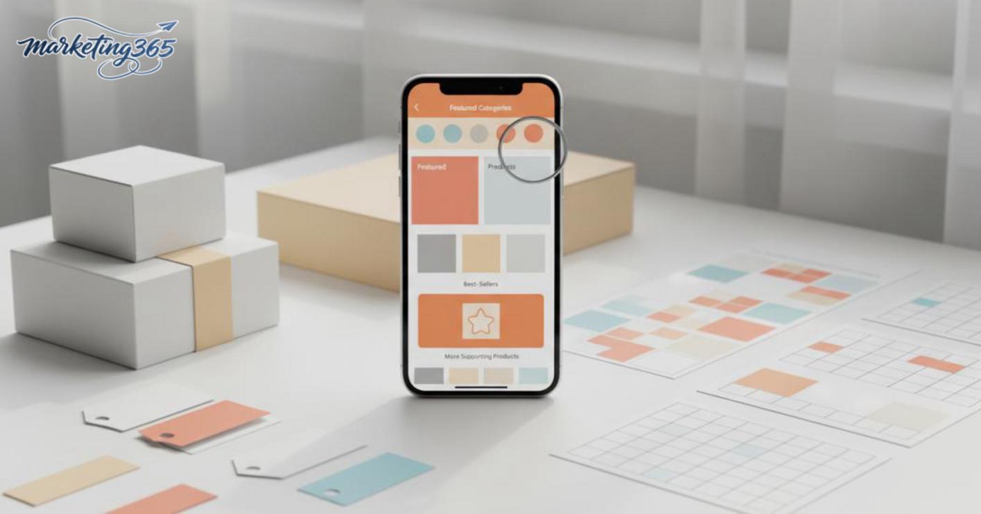
How can you make promotions stand out without being off-putting?
The promotions section should be a visual support layer, not something that overwhelms the entire storefront. The most effective way to make promotions stand out on Shopee is to use a short title, enough contrast, and content that is easy to read on a small screen.
Promotions should be tied to the exact product group being pushed, such as a banner for seasonal bundles or inventory that needs to move faster. If you use a Shopee banner template, check three things: is the text large enough, is the information too long, and does the background color make the main product fade into the background? A banner that is too bright or too text-heavy often makes viewers skip the entire section.
Read more: What Is a Landing Page? High-Converting Landing Pages
How to use images, video, and short descriptions to build trust
Images, video, and short descriptions help the storefront feel less empty while also clarifying the product’s quality, use, and variations. With how to decorate a Shopee storefront to attract customers, this trio should answer three quick questions: what is the item, how is it used, and what makes it different? When shoppers scroll quickly, the main image, short video, and concise description often decide whether they click through or not.
Which product images should be prioritized first?
The first image should clearly show the main product without being covered by too many props. The goal is to help viewers recognize the item within 1–2 seconds, especially when they are browsing categories or looking for an attractive Shopee interface design.
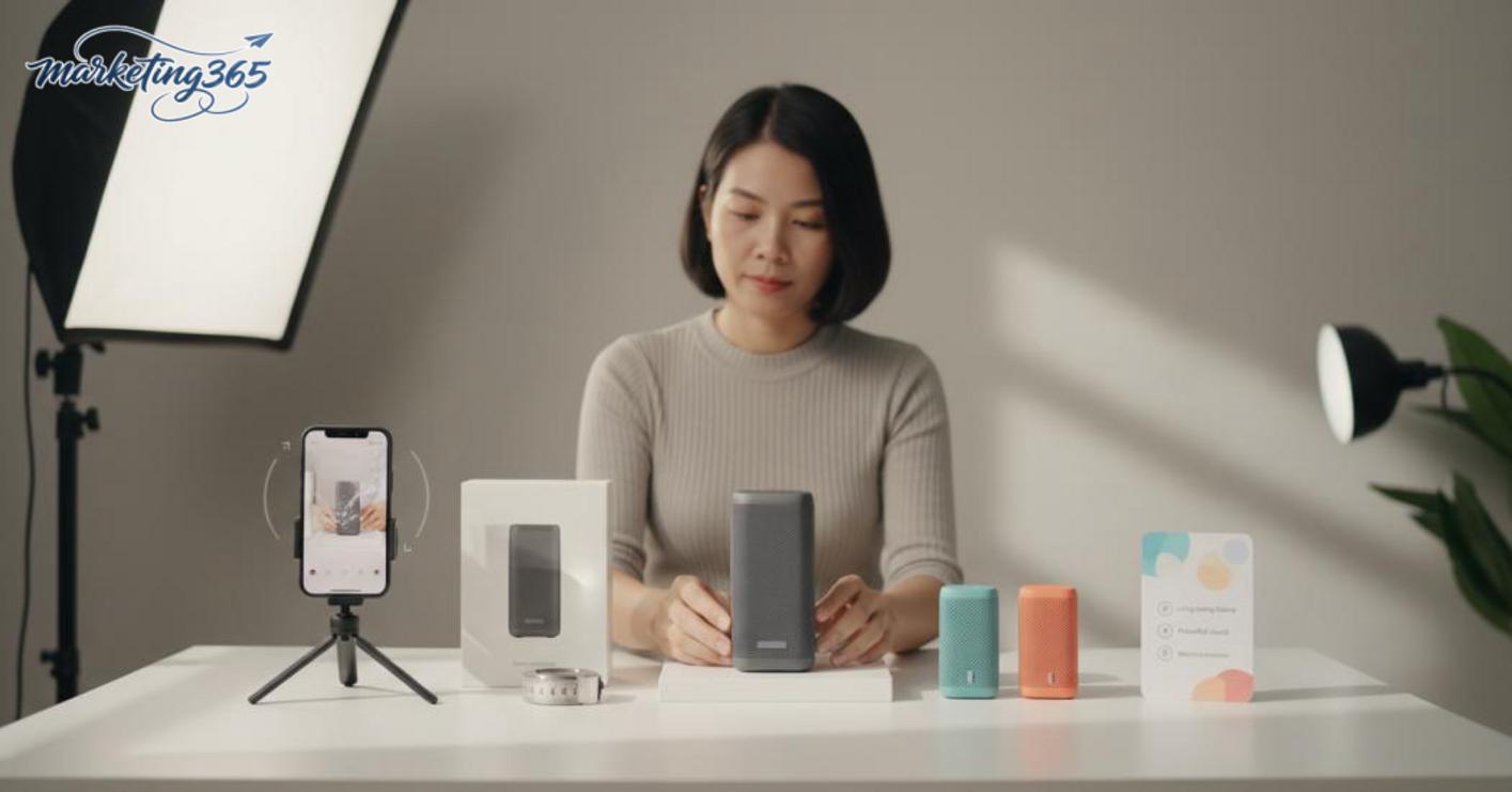
Prioritize images with these signs:
- The product is centered with a clean crop.
- The background is bright and not visually distracting.
- If there are variations, show the color, size, or best-selling pack in the first image.
- Overlay text should be used sparingly, only enough to highlight the function or specification.
For example, with cosmetics, a first image showing the product bottle and a clear label will usually get more clicks than a photo of a decorated table. With home goods, an image that shows the actual size and included accessories is often more convincing than a close-up of the material alone. This is how to create a professional Shopee storefront design without overloading it with effects.
When should you use video instead of images only?
Video should be used when the product needs a demo, when the real material needs to be seen, or when static images may raise doubts. This is a more effective way to use video and visuals to increase appeal on Shopee in situations where shoppers are still unsure whether the product is real.
Add a short video when:
- You need to show how to open, fold, remove, assemble, or use it.
- You need to show softness, thickness, shine, or elasticity.
- You need to show the real size compared with a hand, table, or familiar object.
- The product has multiple variations and still images are hard to tell apart.
The video does not need to be long. It only needs to show the one issue that is making shoppers hesitate. If the video simply repeats the still images, it does not build trust and may even make the interface feel slower. In how to decorate a Shopee storefront to attract customers, a good video answers a real question, while the short description beside it should reinforce one or two key benefits so shoppers understand quickly.
Common mistakes that make a Shopee storefront lose customers
A Shopee storefront loses customers mainly because the presentation makes shoppers distrust it or not know where to click. When a shop already has decent products but still gets few clicks, check the interface, banner, categories, and product arrangement before thinking about ads.
Mistakes that make the shop look unprofessional from the first screen
The first screen decides whether shoppers stay or scroll away within seconds. Too many colors, tiny text, a banner that is unreadable on mobile, or content blocks packed too tightly without a focal point all break the professional Shopee interface.
Read more: How to Sell on Shopee for Beginners: A Complete Guide
Quick fix checklist:
- Keep only 1–2 main colors.
- The banner must be readable on mobile, especially the promotion and product category.
- The Shopee storefront cover image should have consistent fonts, color tones, and spacing.
- If there is too much text, cut it down to one main message.
A new shop often makes the mistake of decorating a Shopee shop for beginners by stuffing every piece of information onto the first page. The result is that viewers do not understand what the shop is best at, even if the products are good.
Layout mistakes that leave shoppers unsure where to click
A cluttered layout makes customers unable to find the product they want, even when the shop has good items. Categories are in the wrong order, featured products are not really featured, and promotions and bestsellers are pushed too far down.
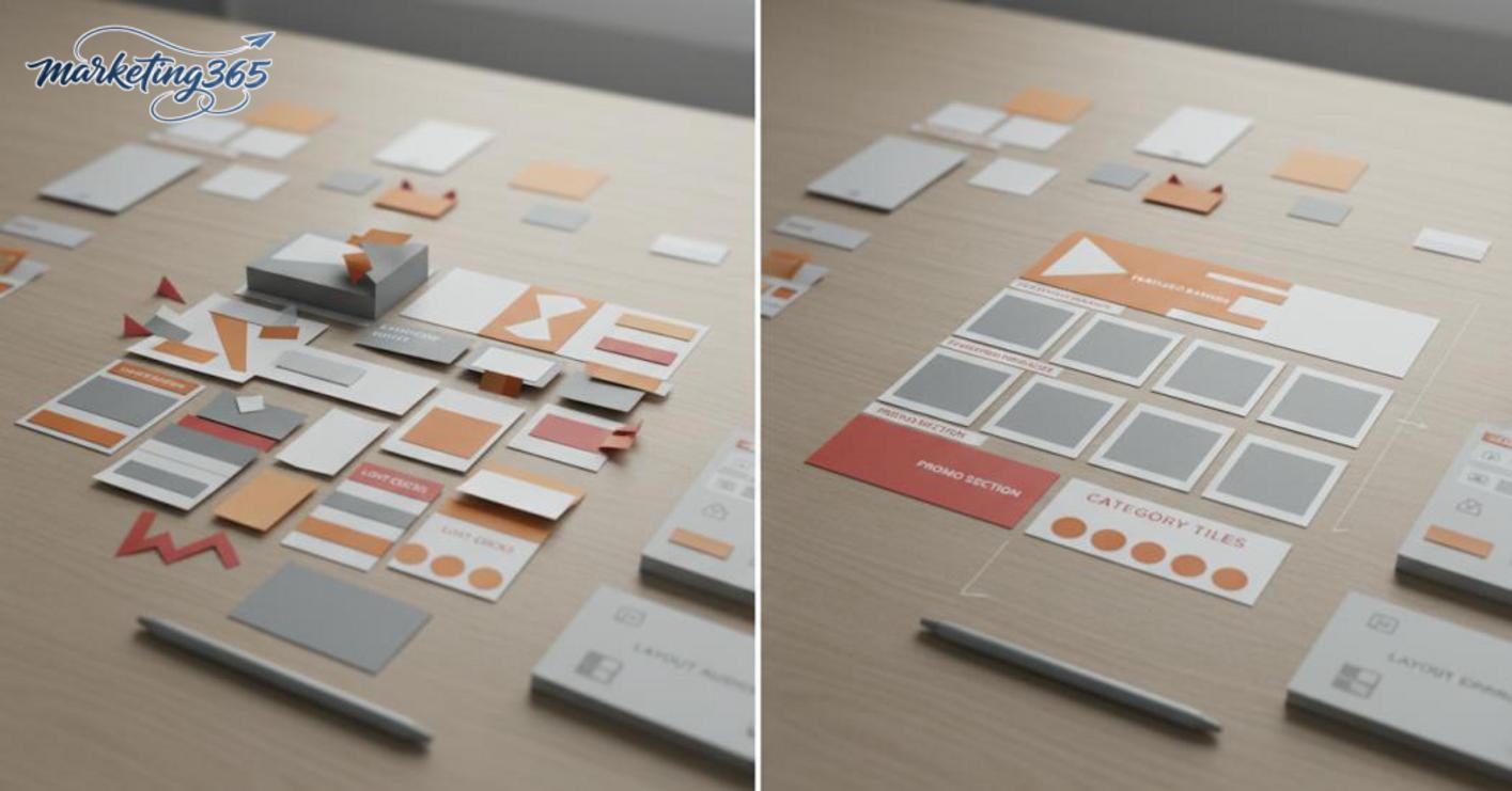
The most effective fix is to prioritize navigation first, then aesthetics:
- Put the most important category first.
- Move best-selling groups or hero products into a highly visible position.
- Separate promotions, new items, and core products clearly.
- Check again on mobile to see where shoppers tap first.
In the way products are arranged on a Shopee storefront, the goal is to reduce the number of times shoppers have to guess. If they have to scroll too long before seeing the product they want, the bounce rate usually rises very quickly. Creating standout categories on Shopee should also support buying behavior, not just fill the interface.
When should you do it yourself, and when should you get professional design support?
Whether you do it yourself or get professional design support depends on the number of products, how cluttered the layout is, and your sales goals. If the shop is new, has few categories, and only needs a few visible fixes, you can optimize it yourself first to save time and keep control. When the storefront has many product groups, inconsistent branding, or low clicks despite decent products, Shopee storefront design needs a more coordinated approach to create a professional Shopee interface and improve the Shopee click-through rate.
When is basic optimization enough?
If the shop has few products, a limited budget, and no complete brand identity yet, just handle the foundation first. With how to decorate a Shopee shop for beginners, prioritize three things: fix the banner so the product category is clear, create easy-to-understand categories, and make the storefront cover image consistent. For example, a accessories shop with only a few dozen products usually does not need a full layout rebuild; just having the profile image, banner, and best-selling product group in visible positions is enough to make it feel tidy.
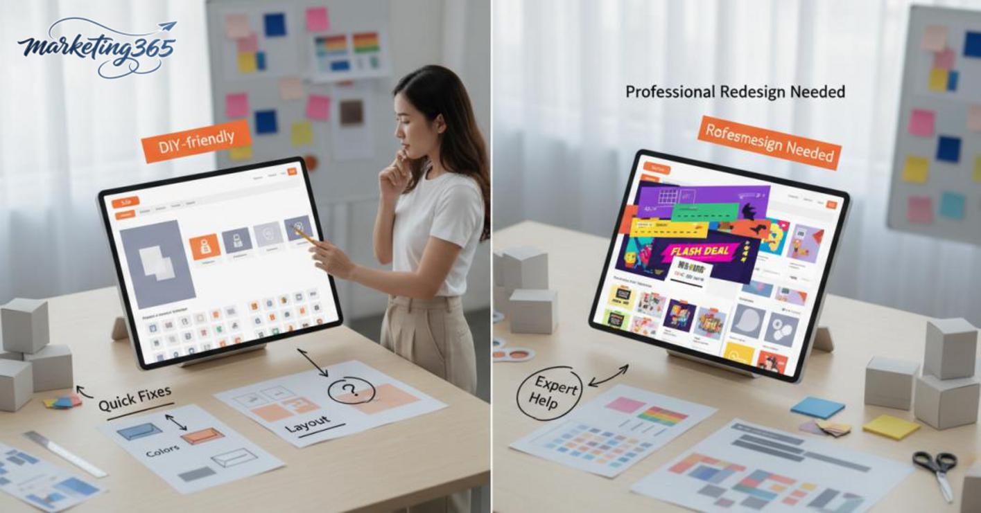
Checklist to follow in order:
- Adjust the banner so shoppers understand what the shop sells within 3 seconds.
- Create standout categories on Shopee based on real buying needs.
- Move core products or bestsellers to the top.
- Check the cover image, font, and background color again so it does not feel cluttered.
When should you fully redesign the entire storefront?
A full redesign is needed when the shop has multiple product lines, different customer groups, and inconsistent branding across the banner, categories, and product images. If you have already changed the images, text, and layout but the click-through rate is still low, the problem usually lies in the visible structure, not just the products. At that point, an attractive Shopee interface design must follow a system: group products into clusters, unify the color palette, clarify the priority of each group, and align the way best-selling products are displayed on Shopee.
Signs that you should upgrade more deeply:
- Customers enter the shop but leave quickly.
- Each category looks different, with no visual flow.
- The banner looks good but does not lead shoppers to products.
- The shop has many good products but struggles to create an eye-catching promotions section on Shopee or a quick-buy highlight.
When these signs appear, Shopee storefront design needs someone with experience to handle the whole visual framework, not just fix isolated pieces.
Frequently asked questions about how to decorate a Shopee storefront to attract customers
This FAQ section should go straight to the first decisions and the real impact of the shop layout, rather than repeating theory. New sellers only need to prioritize the right order, and the click effect becomes clearer when the shop page looks easy to understand, trustworthy, and easy to choose from within the first few seconds.
Where should beginners start when decorating a Shopee storefront?
Start with the banner, categories, top-of-page products, and then product images. If resources are limited, focus on the first visual touchpoints first, because this is where shoppers decide whether to stay in the shop. A new shop only needs a clear banner, tidy categories, and 3–6 top products with consistent images to look much better than an empty storefront.
- Banner: clearly state the main product and an easy-to-remember advantage.
- Categories: divide by real buying groups, not too finely.
- Top products: place bestsellers or core products first.
- Product images: same tone, same frame style, same shooting approach.
Does storefront decoration really help increase Shopee click-through rate?
Yes, but only when the professional Shopee interface helps shoppers understand the shop faster and feel more confident. Beautiful decoration alone will not necessarily increase clicks if the images are blurry, category names are messy, or the top products do not match search intent. On the other hand, a shop with a clear layout, a clean banner, and a well-made Shopee banner often keeps viewers around longer and makes them more likely to click into products.
- The effect is strongest when shoppers are comparing multiple shops.
- It has a strong impact when the homepage looks clean and easy to scan.
- If the shop sells multiple product groups, clear categories can support a better Shopee click-through rate.
For the latest official guidance, you can also refer to materials from Think with Google.
You can also explore more hands-on marketing guides at https://marketing365.vn.
Content from marketing365 is created for SMEs, online shop owners, and new marketers.
You can read more related articles in the Ecommerce Marketing category.